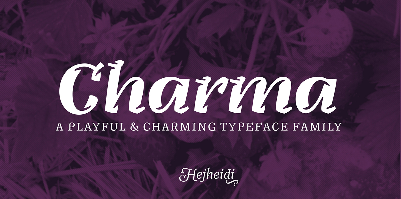


CHARMA TYPEFACE
In the Hague Heidi regularly shopped in an organic grocery store. One day she went there and the visual identity had changed. The new fonts had a great human and personal feel to them, but unfortunately they where poorly constructed, hard to read and the feel was more naive and childish than appropriate for a high quality grocery store.
Heidi took on the task to design a personal and playful yet serious well constructed typeface, that would work perfect for selling products and establish a store identity for food and personal care products.
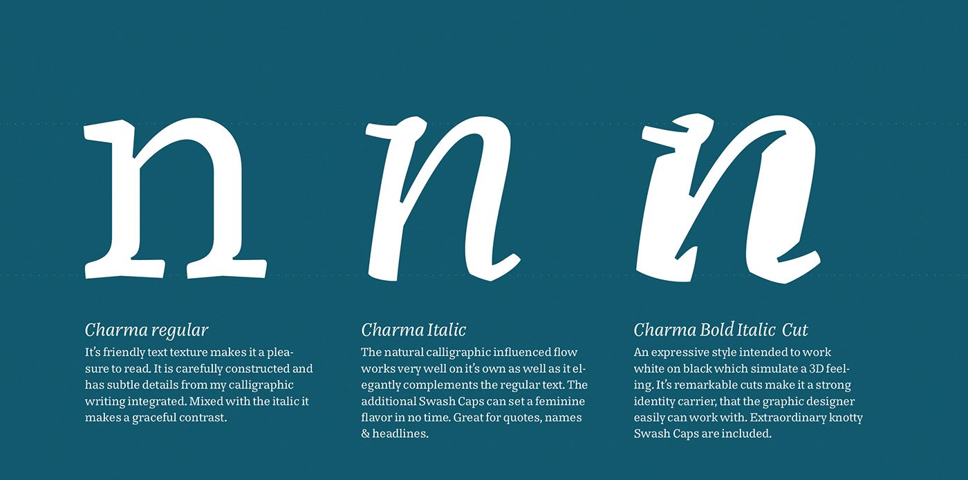
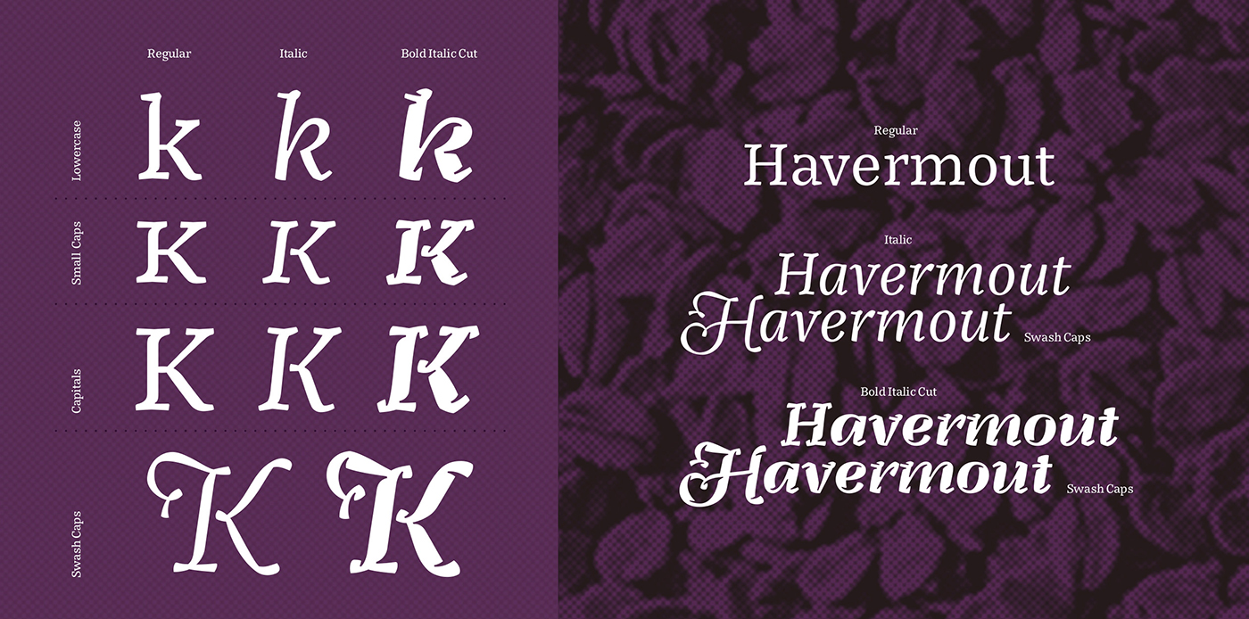
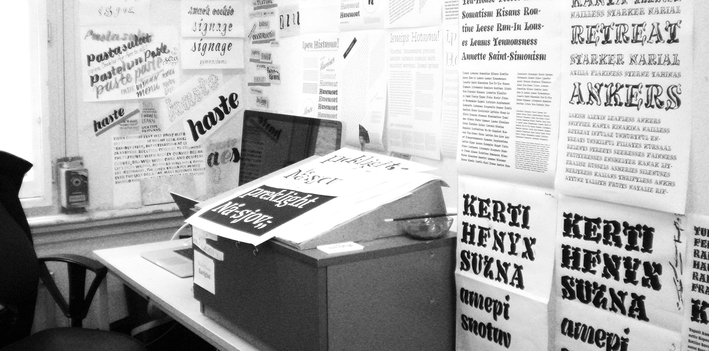
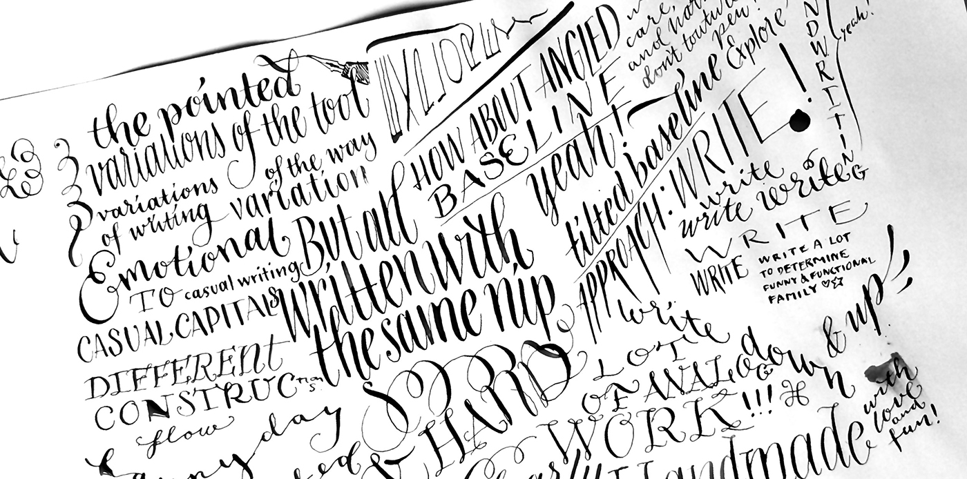
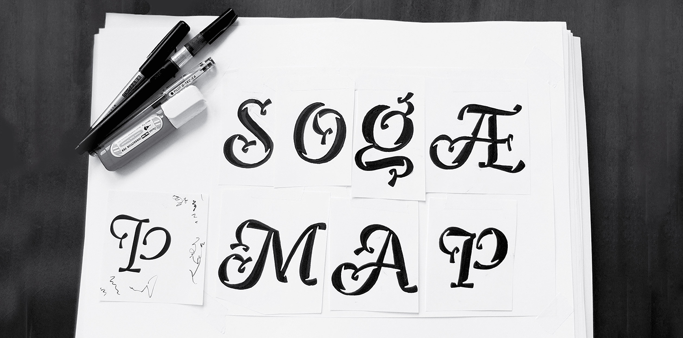
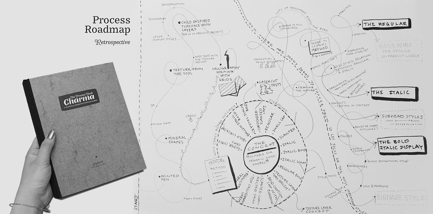
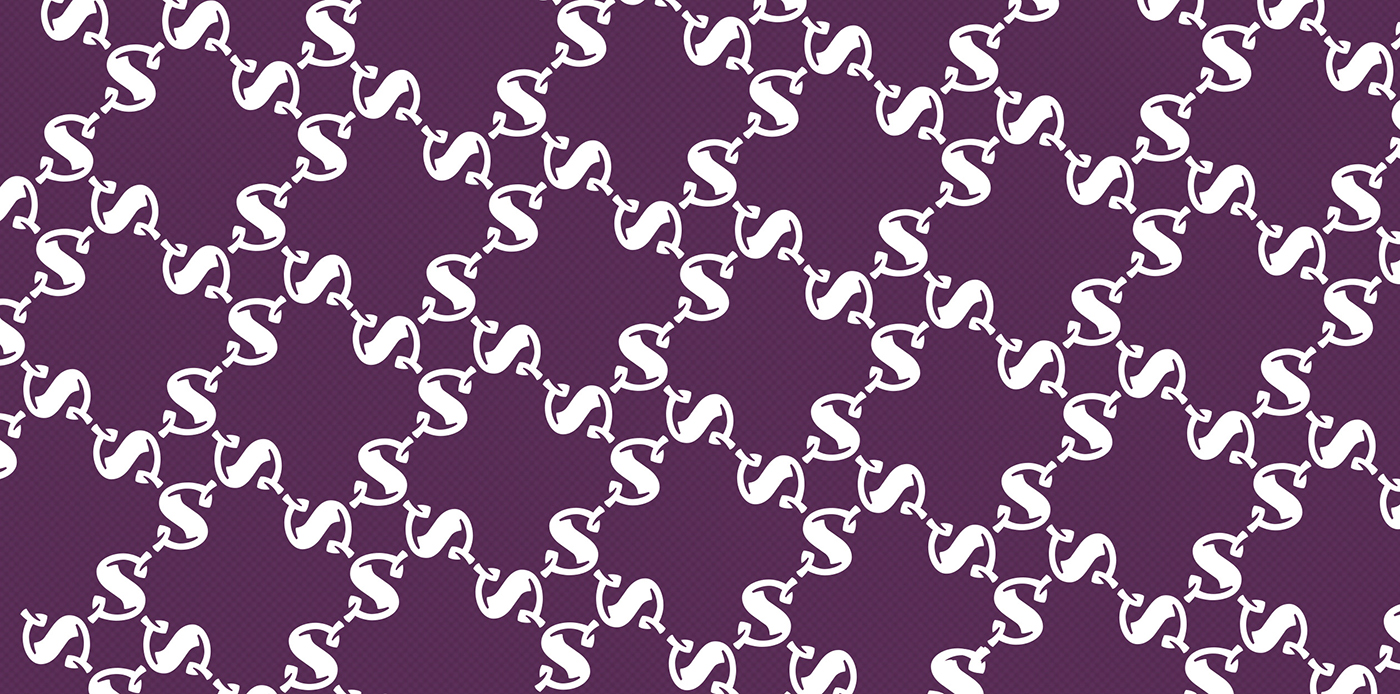
Charma is based on Heidi’s experimental calligraphy that often has curly and flowy characteristics. Heidi created a method to look at the text pattern before making decisions about individual letters details. Right now it the family consists of 3 members and more styles has all ready been sketched ex. a style perfect for store signage and a whole subhead family planned to accompany the display styles.
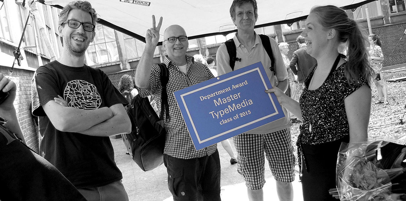
Winner of the TypeMedia Department Award 2015